
A renewed approach
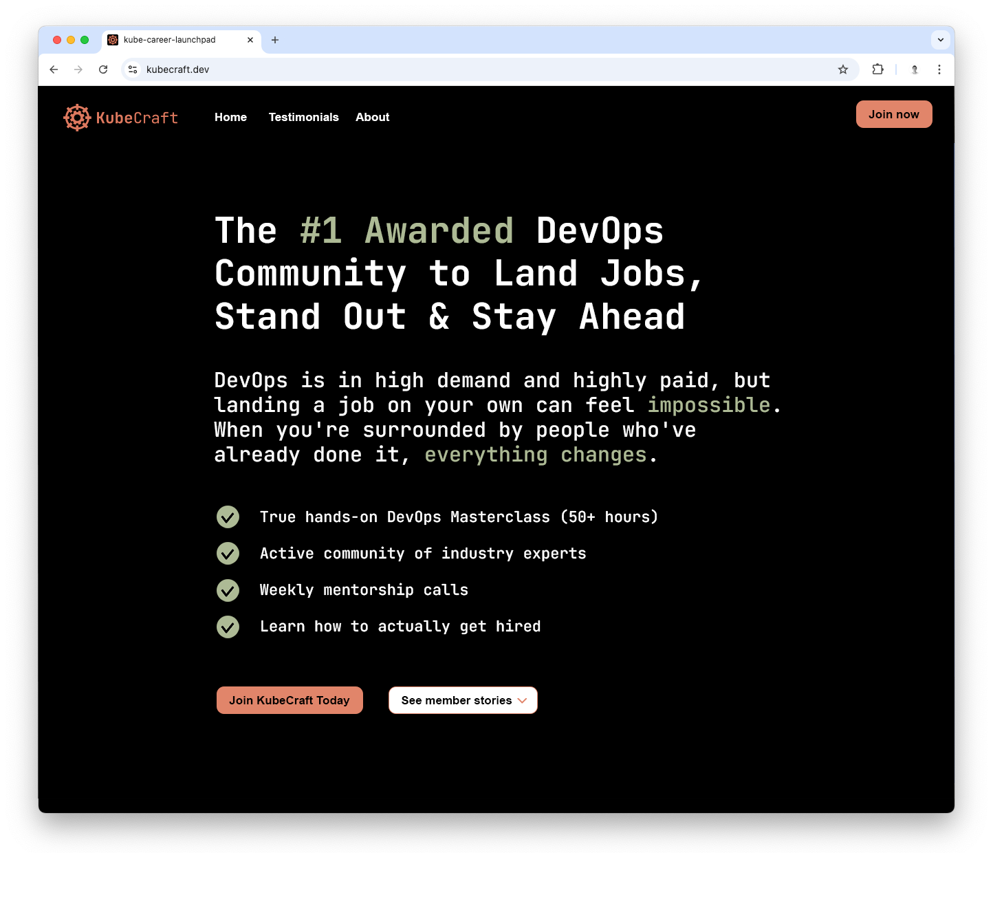
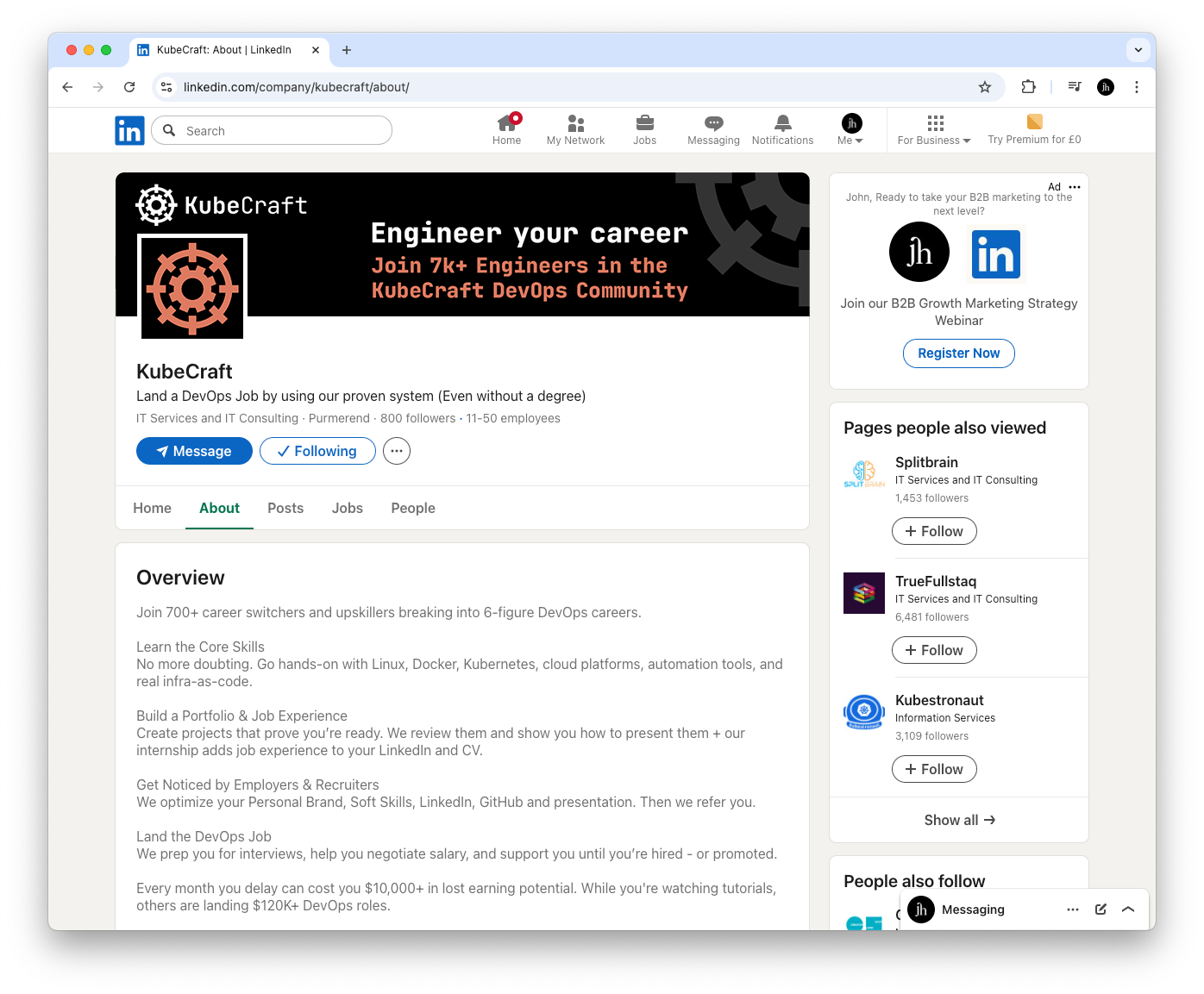
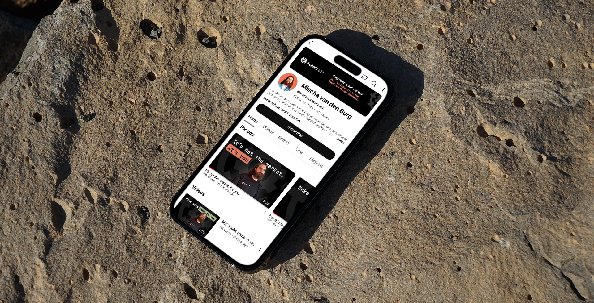
I recently completed the rebranding for KubeCraft, a dynamic DevOps learning platform with thousands of followers across social media. The goal was to refresh the brand’s visual identity and messaging to better reflect its innovative approach to education and community engagement. By focusing on a modern, approachable design and clear, compelling communication, we aimed to strengthen KubeCraft’s presence in the competitive DevOps space while resonating more deeply with its growing audience.
Delving deeper
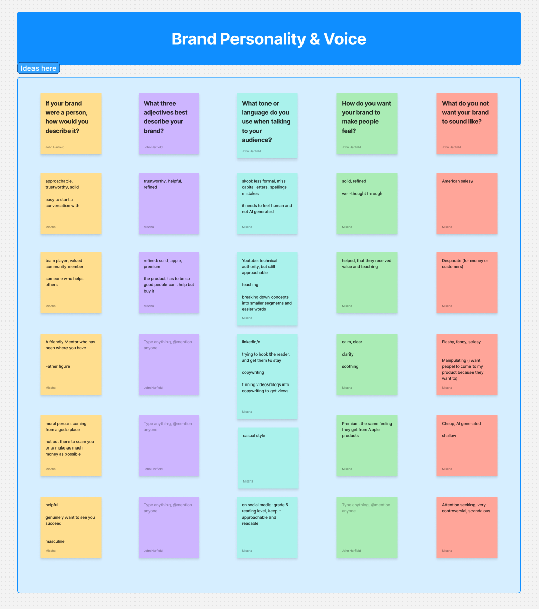
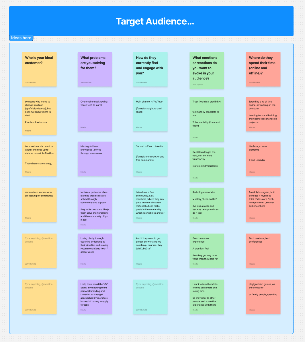
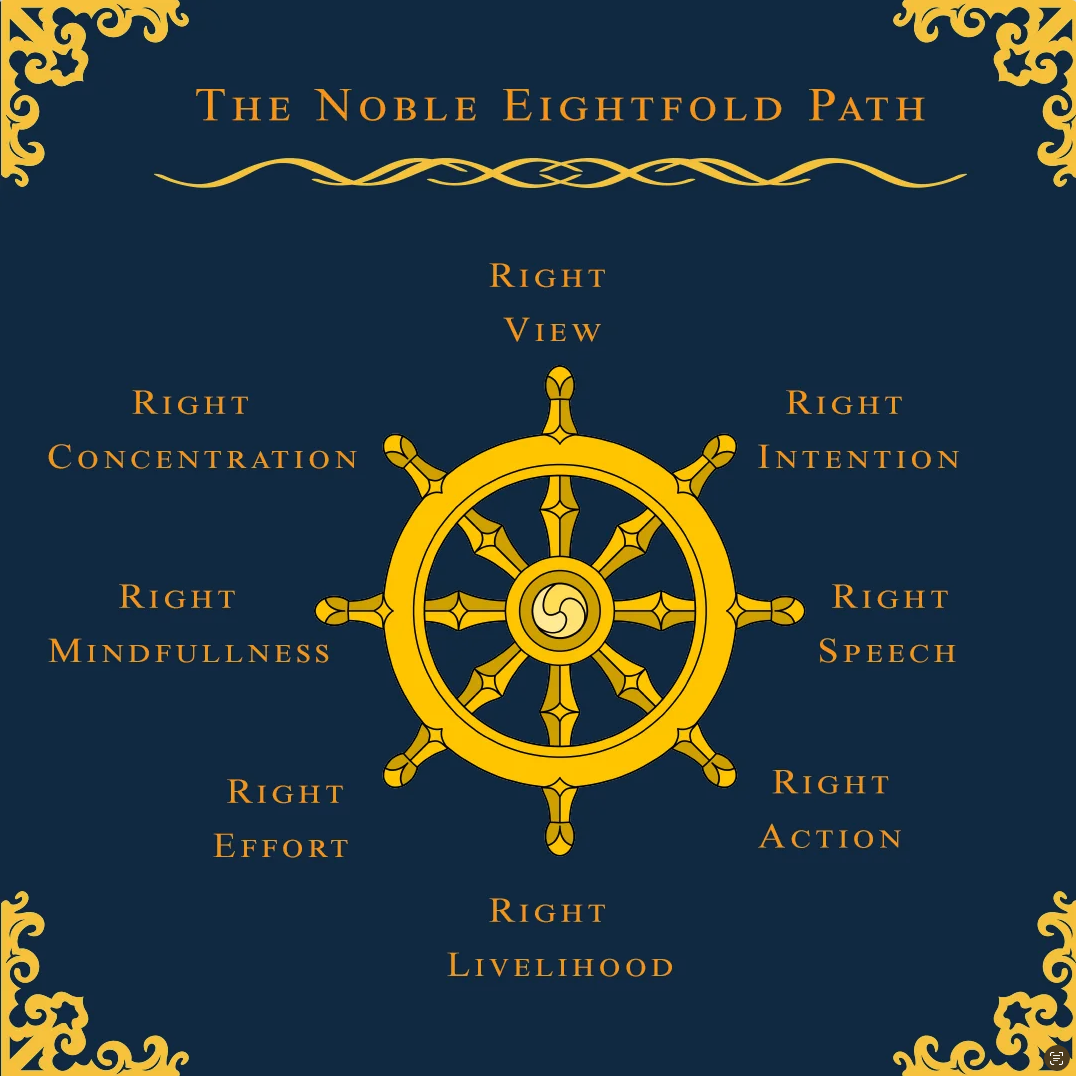
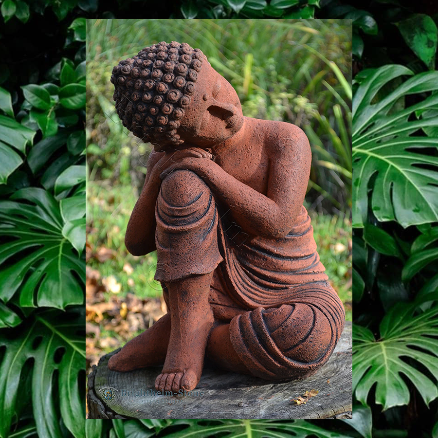
I had a fun and insightful workshop with Mischa, the creative mind behind KubeCraft, where we explored his goals, unique ideas, and what makes his company stand out. It became clear that the brand identity needed to reflect elements of Buddhism, as well as his deep appreciation for nature and his naturally calming presence.
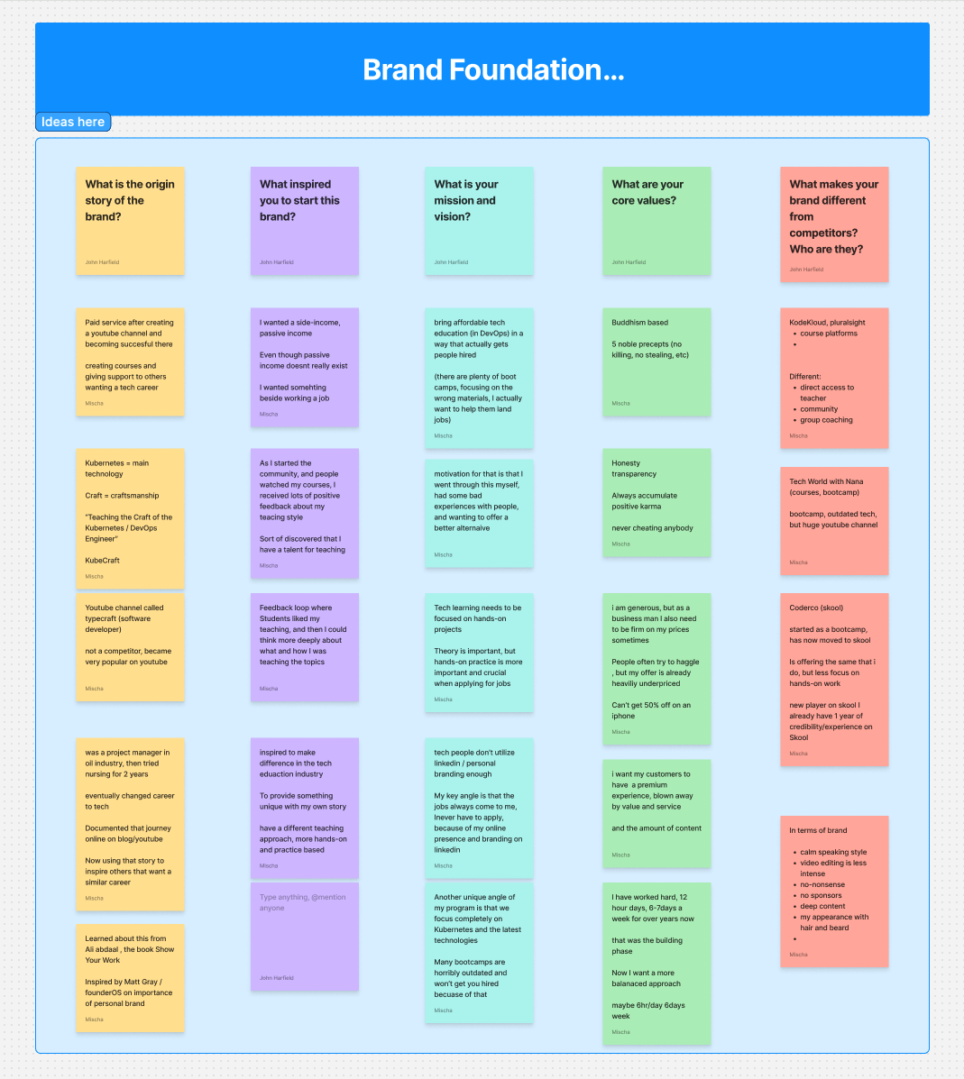
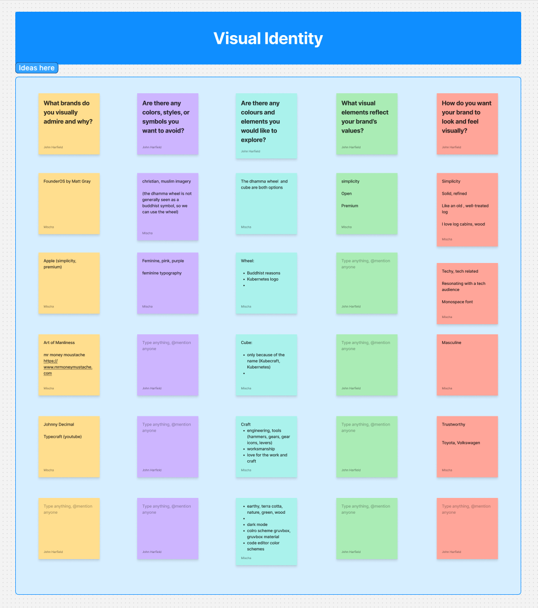
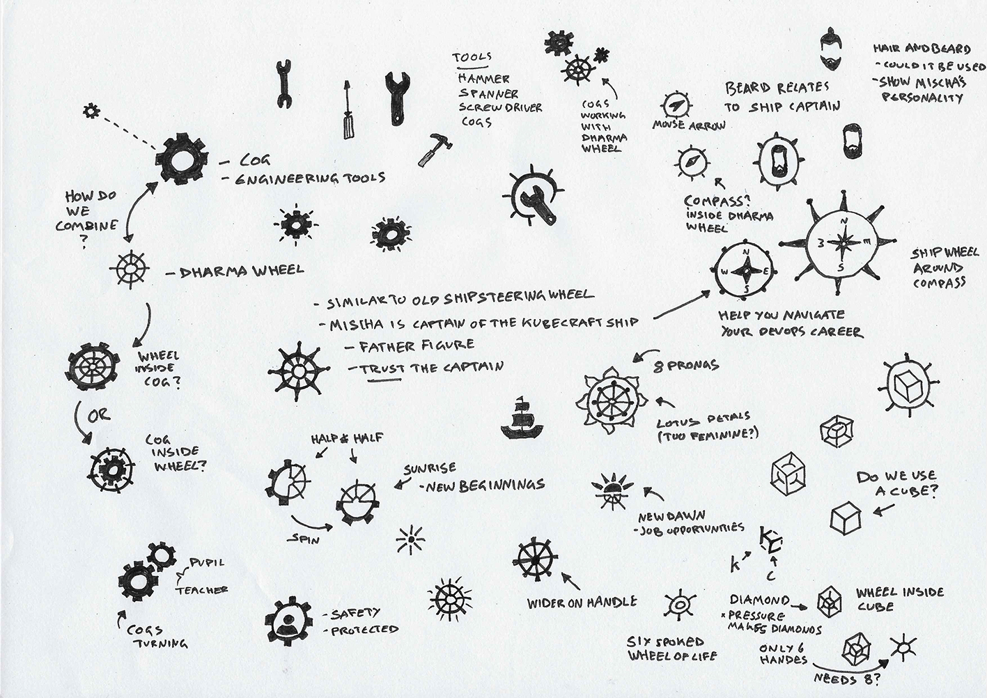
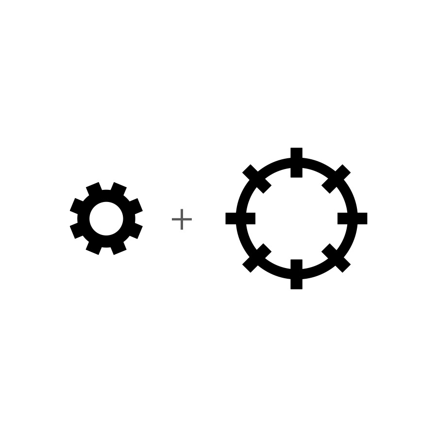
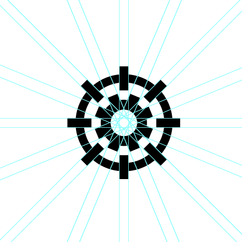
Following the workshop, I leveraged the insights gained to brainstorm and develop a range of preliminary sketches and concepts for the brand identity. The process involved exploring various styles and aesthetics to identify the best fit for the brand. Cogs, Buddhism, and nature emerged as essential components to be integrated into the brand identity.

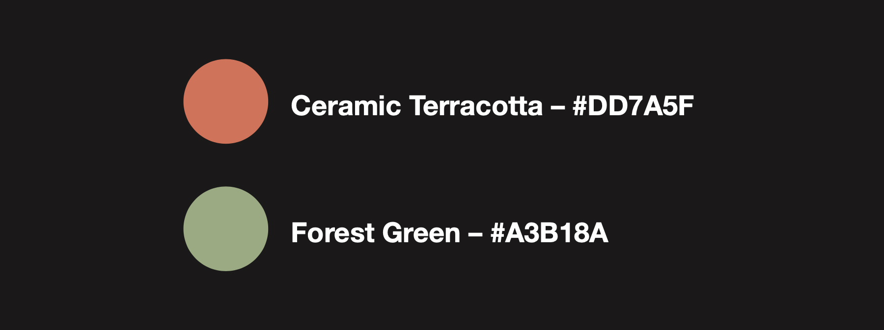
I chose earthy colours for the brand because they create a sense of warmth, authenticity, and connection to nature. These tones evoke stability and groundedness, helping the brand feel approachable and trustworthy. Earthy hues also carry a timeless quality, allowing the visual identity to remain relevant across different trends and seasons. By using this palette, the brand can communicate its values of sustainability, simplicity, and natural beauty while appealing to audiences who appreciate calm, organic aesthetics.
To bring the brand vision to life, I combined symbolic elements that reflect both the technical and personal sides of KubeCraft. The cog represents the inner workings and mechanical precision of the business, while placing it within a wheel subtly echoes the Dharma Wheel—an important nod to Mischa’s connection to Buddhism. The circular form also hints at Mischa’s role as the steady captain guiding the KubeCraft ship. To reinforce the platform’s tech-driven identity, we chose Jet Brains Mono, a monospaced font, adding a clean, modern, and distinctly technical feel to the final design.
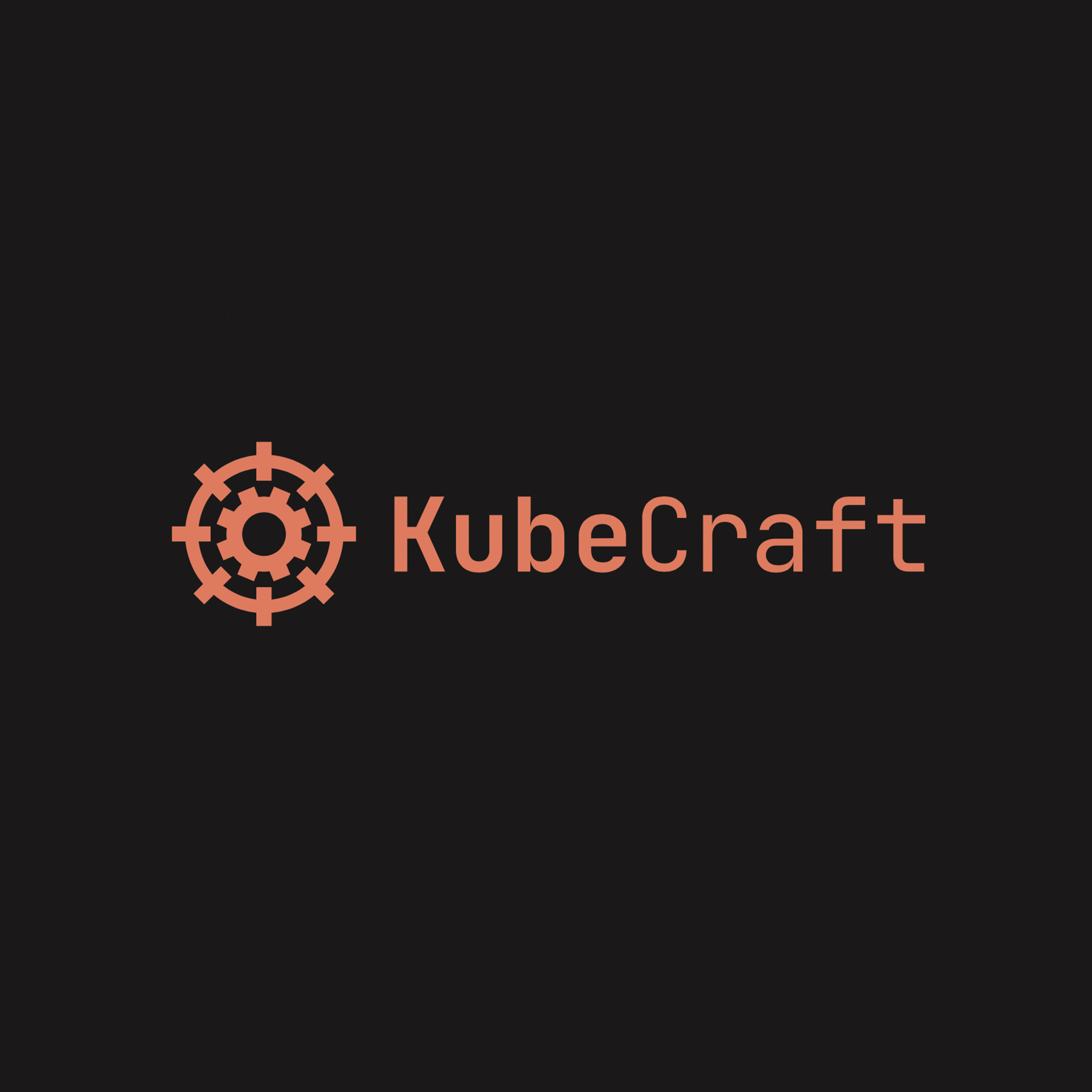
I implemented the new logo on the website and updated all social media platforms to reflect the refreshed branding.
Interested in a rebrand?
