Making sense of it all
I rebranded IMS – It Makes Sense, a London-based technology company, with the aim of creating a more modern, distinctive, and cohesive brand identity. The rebrand focused on refreshing the company’s visual presence while maintaining the core values and recognition of the existing brand. I developed a contemporary identity that better reflects IMS’s position within the technology sector, creating a stronger and more professional brand that can connect with both existing and future customers.
The discovery phase
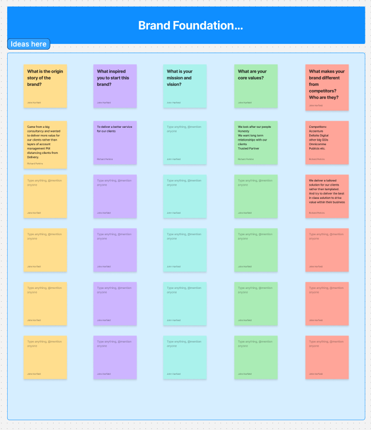
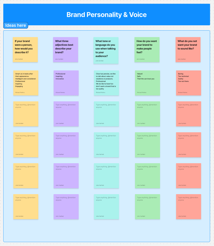
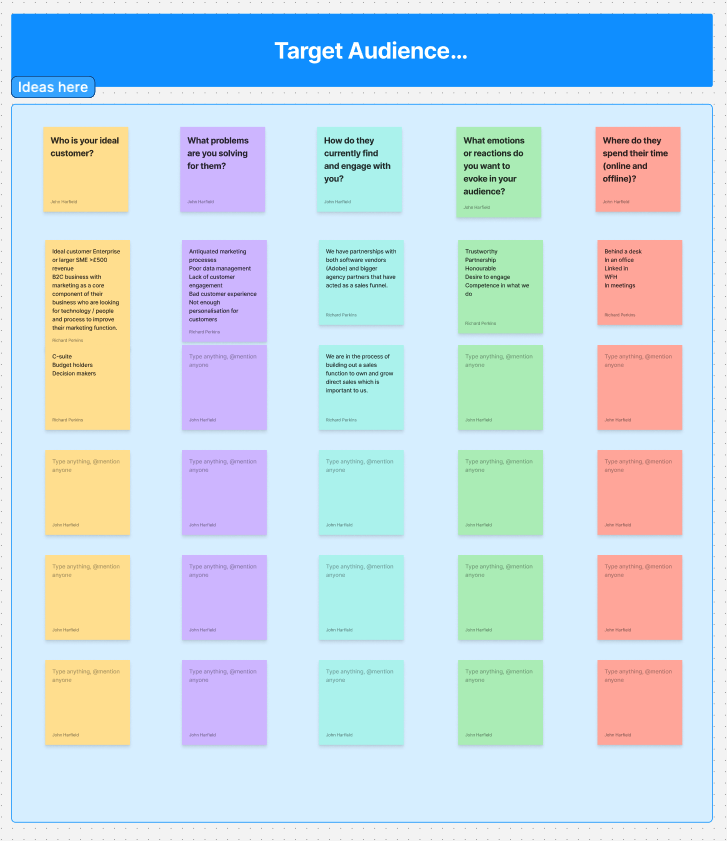
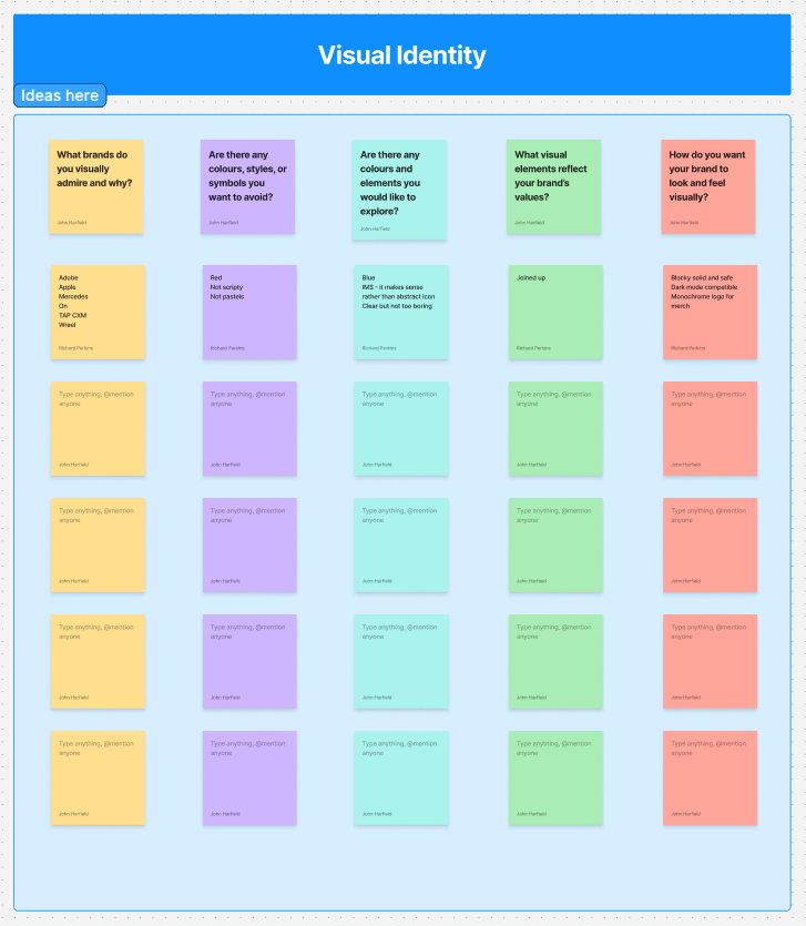
I also conducted an online workshop with the IMS team to understand their vision, values, audience, and goals for the rebrand, using these insights to help shape the new brand identity.
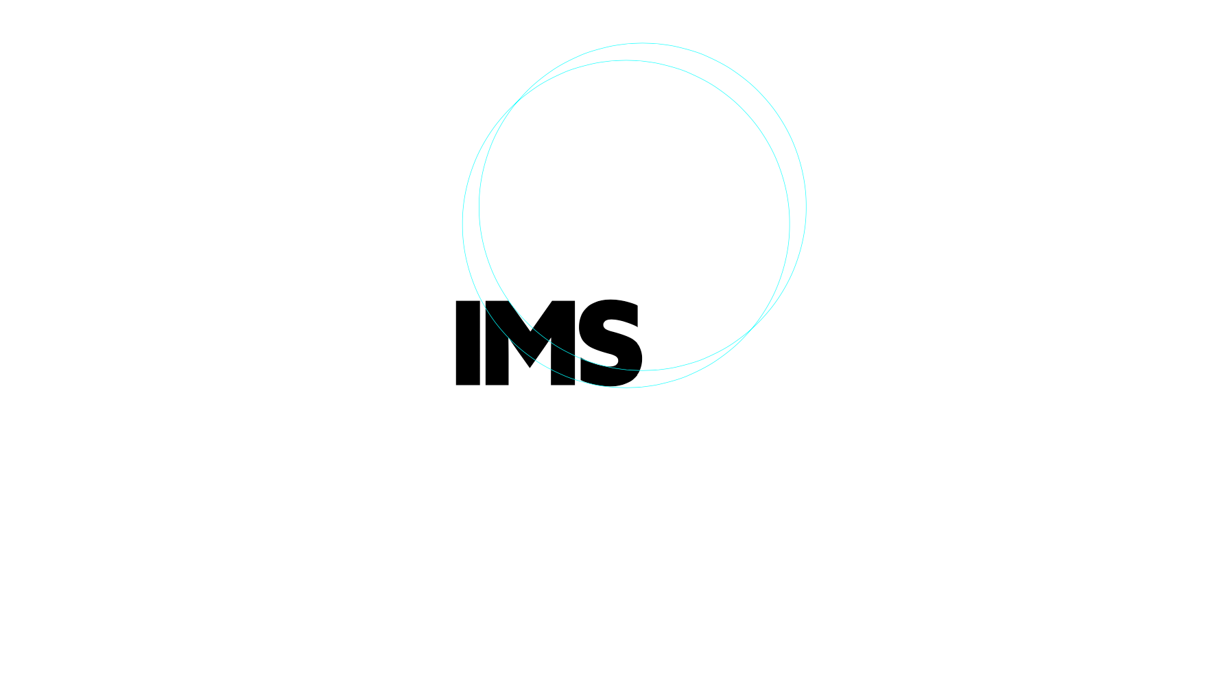
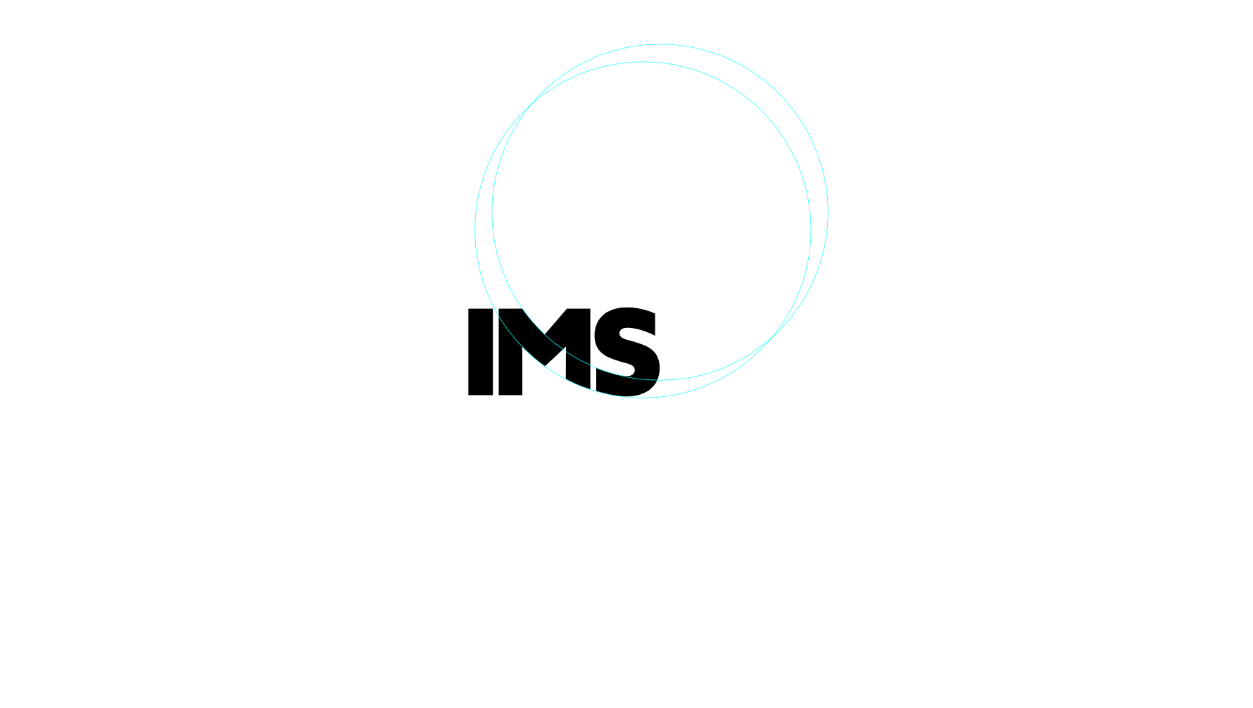
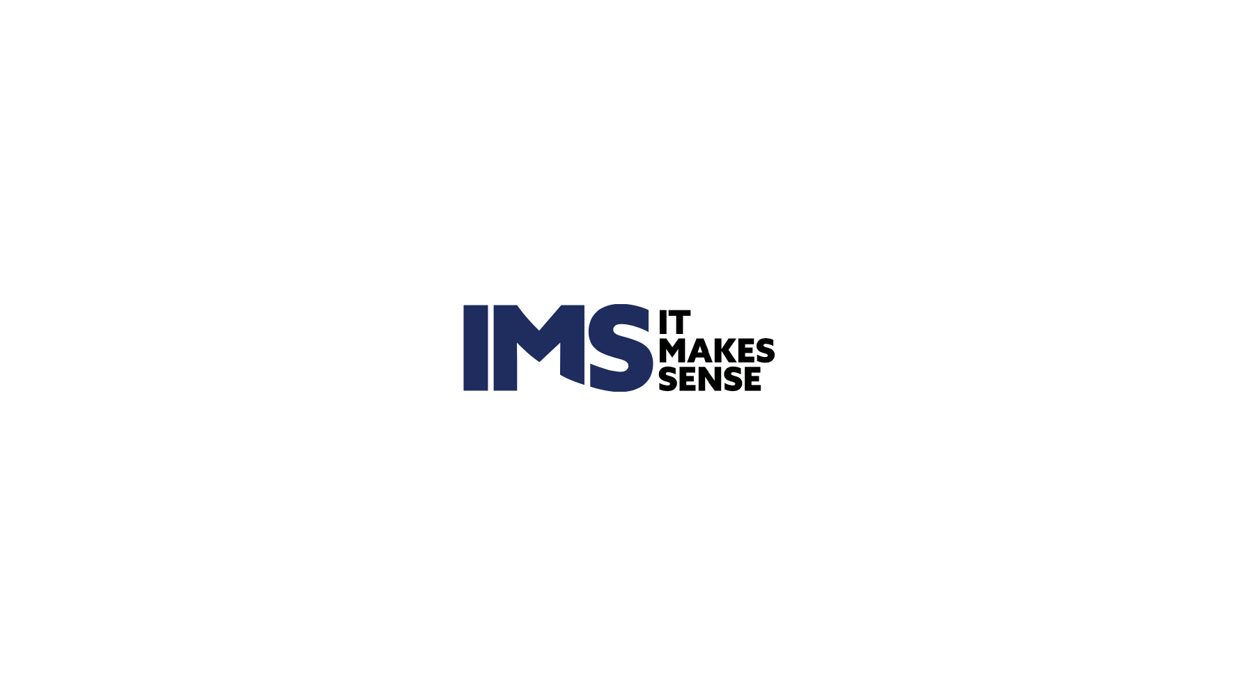
I created the logo by using circles and visual techniques to experiment with shape, balance, and positioning. The circles helped me create a sense of movement and connection around the main letters, while the bold typography makes the logo clear and easy to recognise. I chose blue as the main colour because it represents trust, reliability, confidence, and professionalism, which helps communicate a strong and positive identity for the brand.
Brand Guidelines
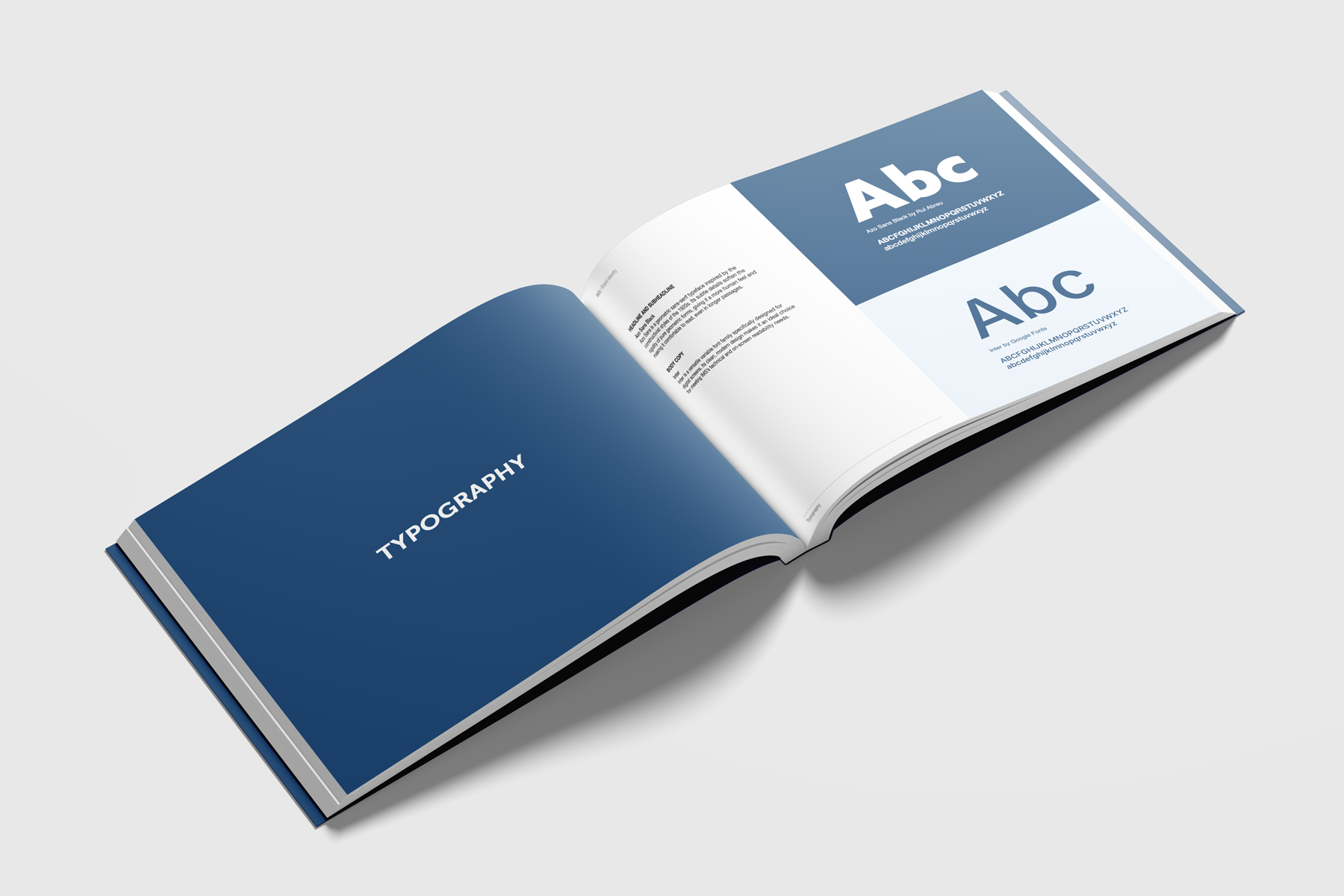
I developed the comprehensive IMS brand guidelines, establishing a clear and consistent visual identity across the brand, including its logo, colour palette, typography, merchandise, and photography direction.
Digital upgrade
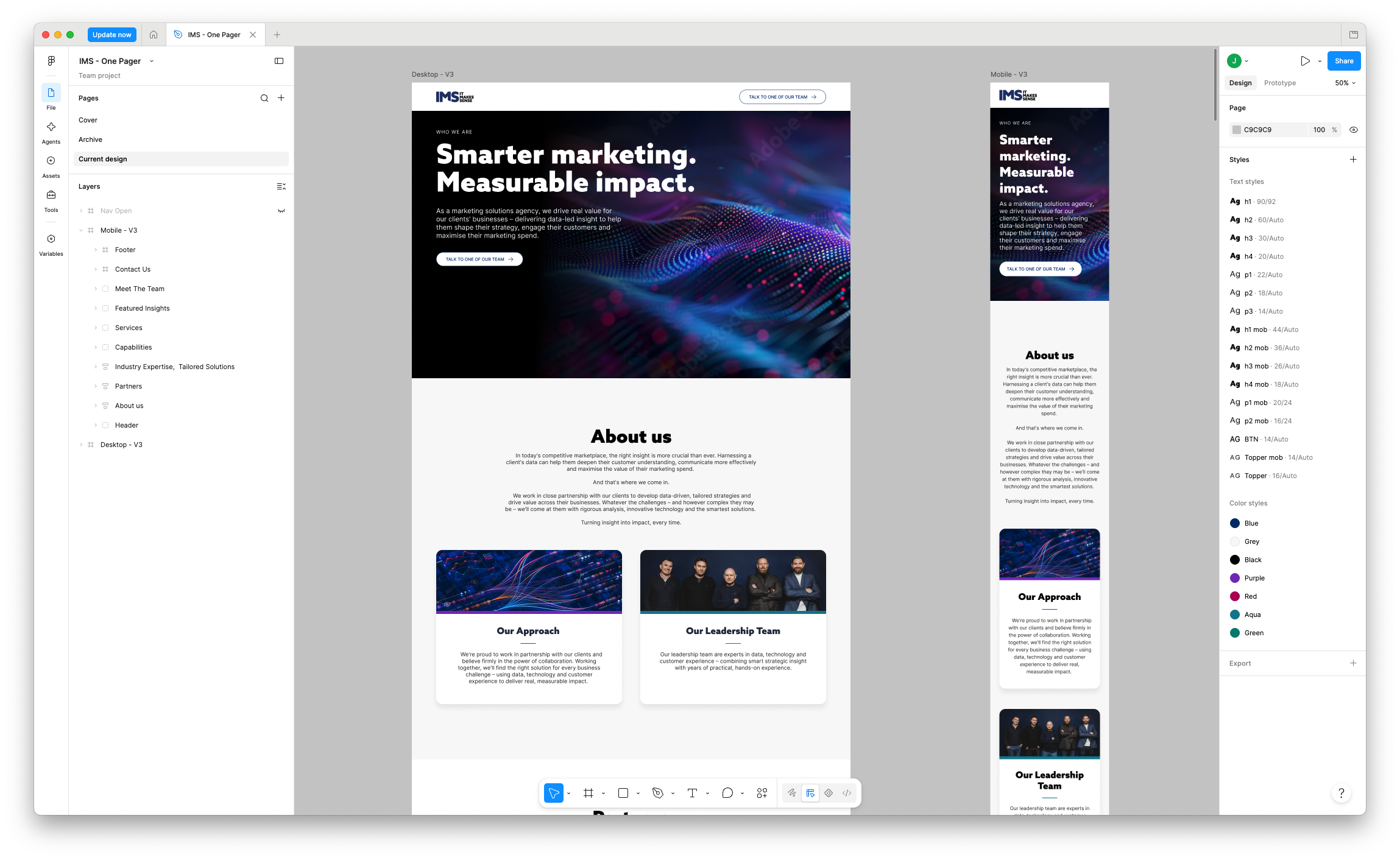
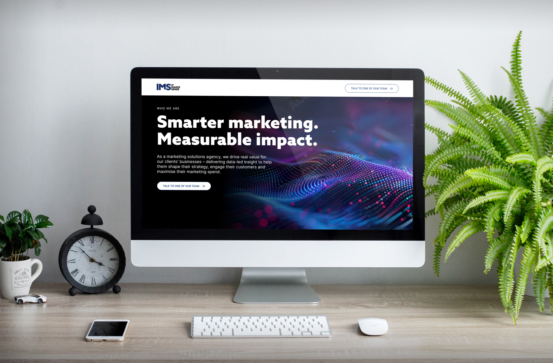
I designed the new IMS website in Figma, creating a clear and engaging digital experience that aligned with the rebranded identity. I worked closely with their developer throughout the build to ensure the final website was implemented accurately and looked and functioned as intended when it went live.
Merch
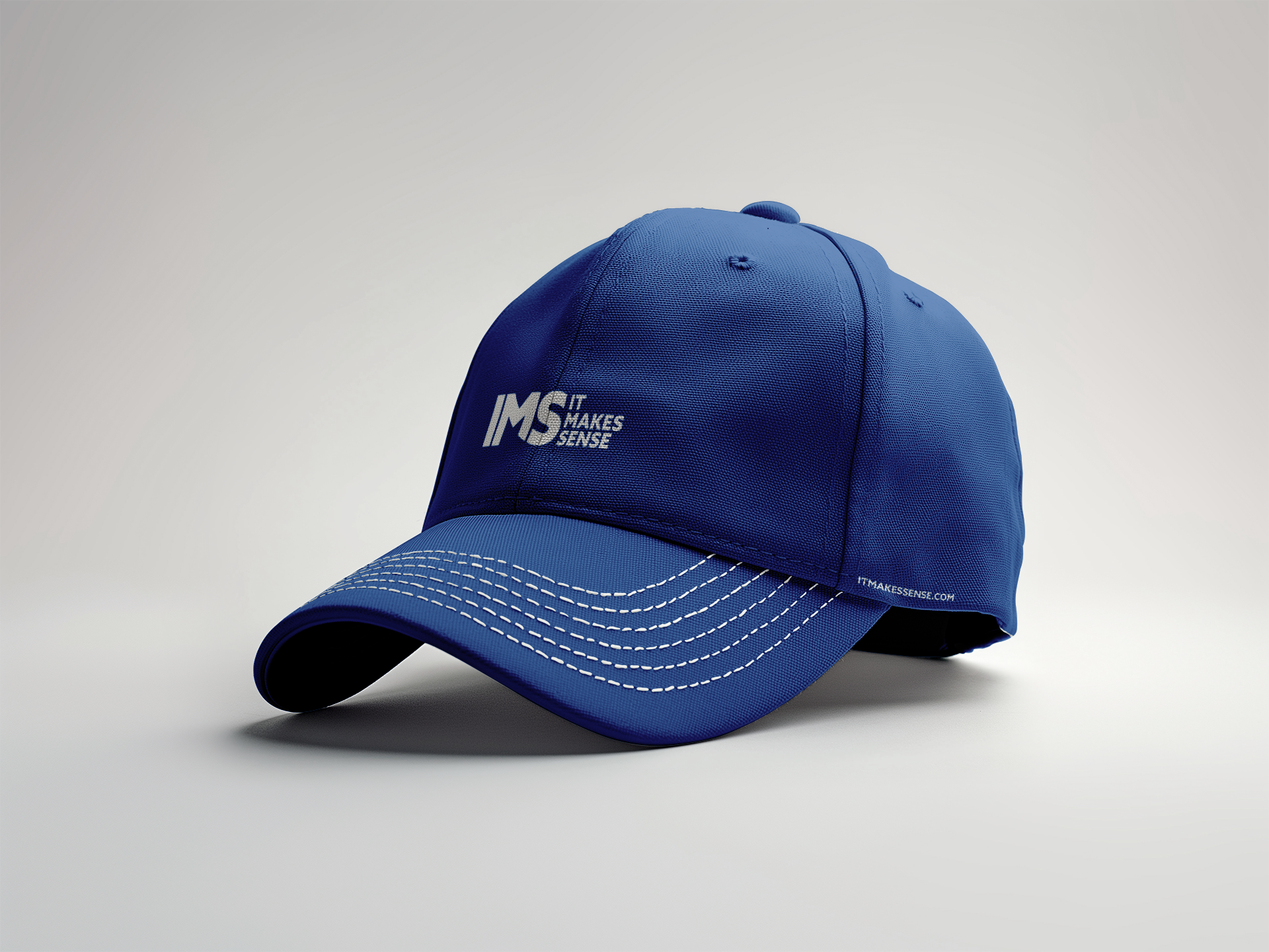
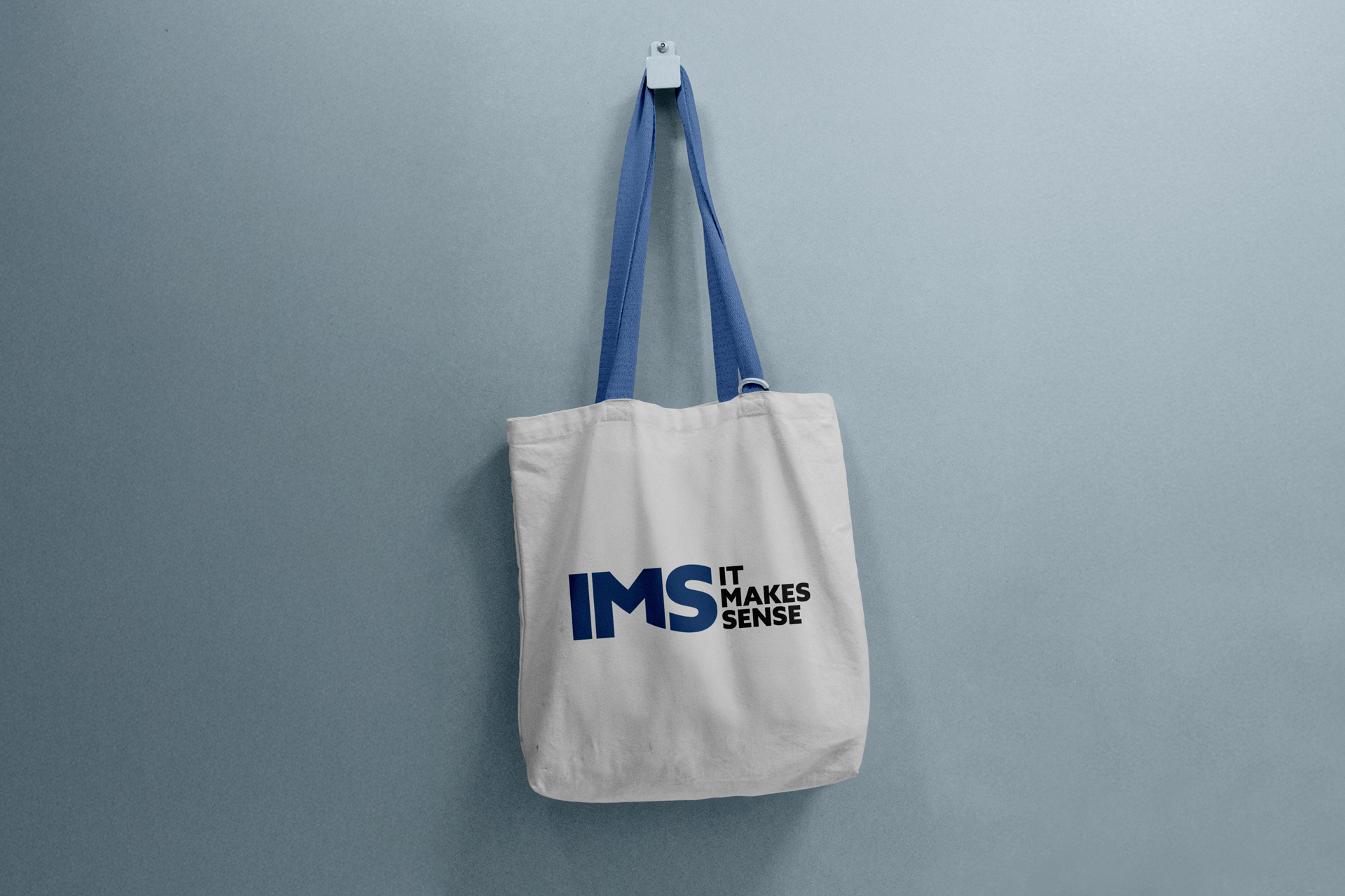
I applied the new brand identity across a range of merchandise, including caps, tote bags, water bottles, and other branded items, creating a consistent and recognisable look across both digital and physical touchpoints.
View similar projects