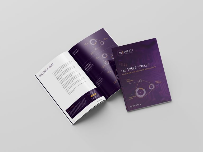
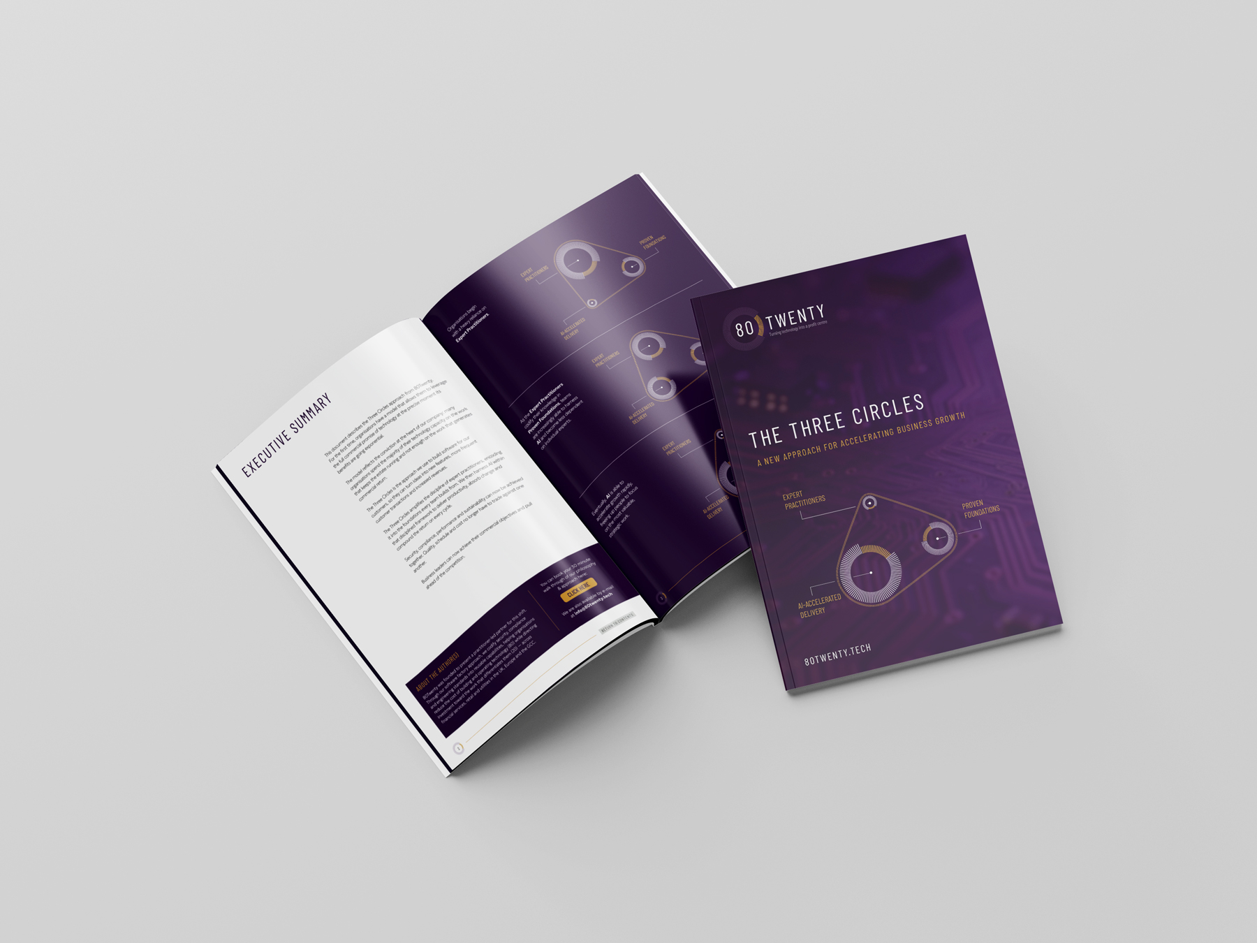
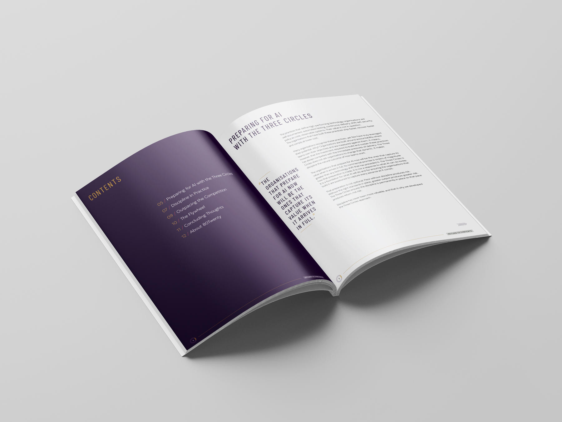
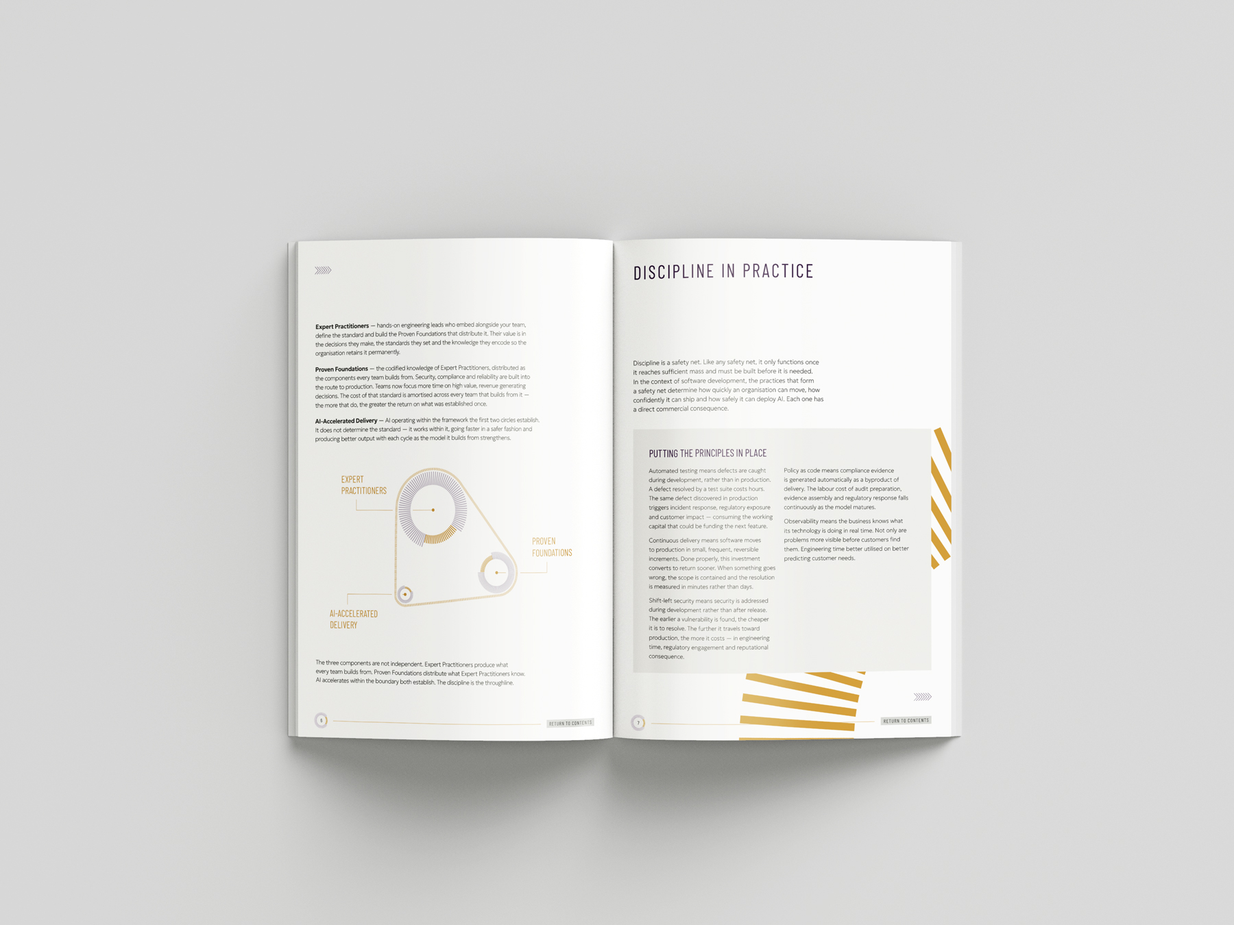
I designed a whitepaper for 80TWENTY, translating their brand identity into a cohesive and engaging editorial document. To create a strong visual connection to the company, I incorporated their distinctive brand marque as the foundation for the document’s visual mechanism, using its form and geometry to structure and guide key elements throughout the layout. This helped transform an existing brand asset into a functional design system, while maintaining consistency with 80TWENTY’s identity and creating a whitepaper that feels both considered and distinctly theirs.
The full whitepaper can be seen here: www.80twenty.tech/whitepapers/three-circles.pdf
Looking for brochure design?
View similar projects